Data analysis and visualization are fundamental to a data-driven decision-making process. To grasp the best strategy for our scenario, we delve into the data analysis and visualization phase of the process, making data models, analyzes and diagrams that allow us to tell stories from the data.
With the understanding of best practices for data analysis and visualization, we start by creating a code-based dashboard using Python, Pandas and Plotly. We then follow up by using a high-quality enterprise tool, such as Looker, to construct a low-code cloud-hosted dashboard, providing us with insights into the type of effort each method takes.
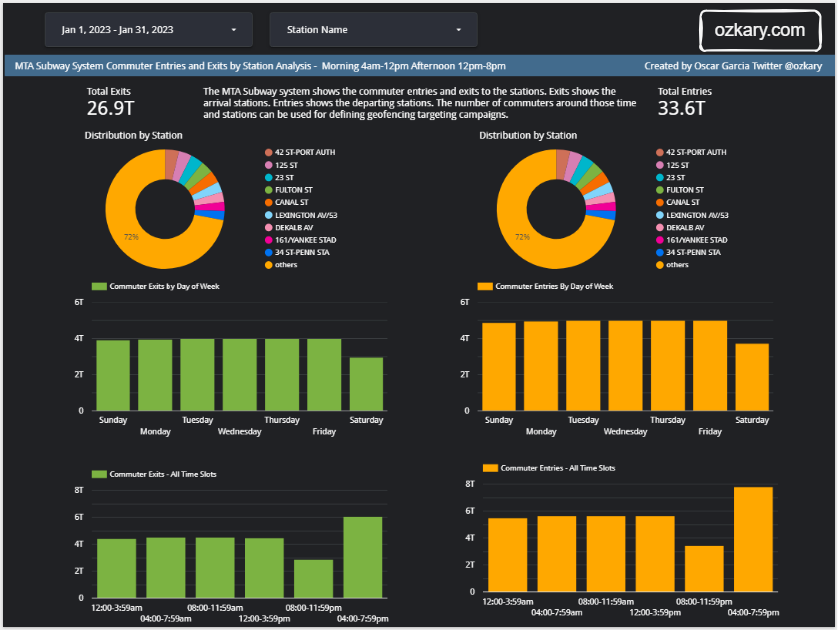
👍 This is a dashboard created with Looker. Similar dashboards can be created with PowerBI and Tableau

Once we have designed our dashboard, we can align it with our initial requirements and proceed to formulate the data analysis conclusions, thereby facilitating informed business decisions for stakeholders. However, before delving into coding, let's commence by reviewing the data analysis specifications, which provide the blueprint for our implementation effort.
Specifications
At this stage of the process, we have a clear grasp of the requirements and a deep familiarity with the data. With these insights, we can now define our specifications as outlined below:
- Identify pertinent measures such as exits and entries
- Conduct distribution analysis based on station
- This analysis delineates geographical boundary patterns
- Conduct distribution analysis based on days of the week and time slots
By calculating the total count of passengers for arrivals and departures, we gain a holistic comprehension of passenger flow dynamics. Furthermore, we can employ distribution analysis to investigate variations across stations, days of the week, and time slots. These analyses provide essential insights for business strategy and decision-making, allowing us to identify peak travel periods, station preferences, and time-specific trends that can help us make informed decisions.
Data Analysis Requirements
In our analysis process, we can adhere to these specified requirements:
- Determine distinct time slots for morning and afternoon analysis:
12:00 AM - 3:59 AM 04:00 AM - 7:59 AM 08:00 AM - 11:59 AM 12:00 PM - 3:59 PM 04:00 PM - 7:59 PM 08:00 PM - 11:59 PM - Examine data regarding commuter exits (arrivals) and entries (departures)
- Implement a master filter for date ranges, which exerts control over all charts
- Incorporate a secondary filter component to facilitate station selection
- Display the aggregate counts of entries and exits for the designated date range
- Employ score card components for this purpose
- Investigate station distributions to identify the most frequented stations
- Utilize donut charts, with the subway station name as the primary dimension
- Analyze distributions using the day of the week to unveil peak traffic days
- Employ bar charts to visualize entries and exits per day
- Explore distributions based on time slots to uncover daily peak hours
- Integrate bar charts to illustrate entries and exits within each time slot
Dashboard Design
In the dashboard design, we can utilize a two-column layout, positioning the exits charts in the left column and the entries charts in the right column of the dashboard. Additionally, we can incorporate a header container to encompass the filters, date range, and station name. To support multiple devices, we need a responsive layout. We should note that when using a platform like Looker, there is really no responsive layout, but we need to define different layouts for mobile and desktop.
Layout Configuration:
- Desktop 1200px by 900px
- Mobile 360px by 1980px
UI Components
For our dashboard components, we should incorporate the following:
- Date range picker
- Station name list box
- For each selected measure (exits, entries), we should employ a set of the following components:
- Score cards for the total numbers
- Donut charts for station distribution
- Bar charts for day of the week distribution
- Bar charts for time slot distribution
Review the Code - Code Centric
The dashboard layout is done using HTML for the presentation and Python to build the different HTML elements using the dash library. All the charts are generated by plotly.
# Define the layout of the app
app.layout = html.Div([
    html.H4("MTA Turnstile Data Dashboard"),

    dcc.DatePickerRange(
        id='date-range',
        start_date=data['created_dt'].min(),
        end_date=data['created_dt'].max(),
        display_format='YYYY-MM-DD'
    ),

    dbc.Row([
        dbc.Col(
            dbc.Card(
                dbc.CardBody([
                    html.P("Total Entries"),
                    html.H5(id='total-entries')
                ]),
                className='score-card'
            ),
            width=6
        ),
        dbc.Col(
            dbc.Card(
                dbc.CardBody([
                    html.P("Total Exits"),
                    html.H5(id='total-exits')
                ]),
                className='score-card'
            ),
            width=6
        )
    ], className='score-cards'),

    dbc.Row([
            dbc.Col(
                dcc.Graph(id='top-entries-stations', className='donut-chart'),
                width=6
            ),
            dbc.Col(
                dcc.Graph(id='top-exits-stations', className='donut-chart'),
                width=6
            )
    ], className='donut-charts'),

    dbc.Row([
                dbc.Col(
                    dcc.Graph(id='exits-by-day', className='bar-chart'),
                    width=6
                ),
                dbc.Col(
                    dcc.Graph(id='entries-by-day', className='bar-chart'),
                    width=6
                )
    ], className='bar-charts'),

    dbc.Row([
                dbc.Col(
                    dcc.Graph(id='exits-by-time', className='bar-chart'),
                    width=6
                ),
                dbc.Col(
                    dcc.Graph(id='entries-by-time', className='bar-chart'),
                    width=6
                )
    ], className='bar-charts')

])
The provided Python code is building a web application dashboard layout using Dash, a Python framework for creating interactive web applications. This dashboard is designed to showcase insights and visualizations derived from MTA Turnstile Data. Here's a breakdown of the main components:
App Layout: The
app.layoutdefines the overall structure of the dashboard using thehtml.Divcomponent. It acts as a container for all the displayed componentsTitle:
html.H4("MTA Turnstile Data Dashboard")creates a header displaying the title of the dashboardDate Picker Range: The
dcc.DatePickerRangecomponent allows users to select a date range for analysis. It's a part of Dash Core Components (dcc)Score Cards: The
dbc.Rowanddbc.Colcomponents create rows and columns for displaying score cards usingdbc.Cardanddbc.CardBody. These cards show metrics like "Total Entries" and "Total Exits"Donut Charts: Another set of
dbc.Rowanddbc.Colcomponents creates columns for displaying donut charts using thedcc.Graphcomponent. These charts visualize the distribution of top entries and exits by stationBar Charts: Similar to the previous sections,
dbc.Rowanddbc.Colcomponents are used to create columns for displaying bar charts using thedcc.Graphcomponent. These charts showcase the distribution of exits and entries by day of the week and time slotCSS Classnames: The
classNameattribute is used to apply CSS class names to the components, allowing for custom styling using CSS
In summary, the code establishes the layout of the dashboard with distinct sections for date selection, score cards, donut charts, and bar charts. The various visualizations and metrics offer valuable insights into MTA Turnstile Data, enabling users to comprehend passenger flow patterns and trends effectively.
def update_dashboard(start_date, end_date):
    filtered_data = data[(data['created_dt'] >= start_date) & (data['created_dt'] <= end_date)]

    total_entries = filtered_data['entries'].sum() / 1e12  # Convert to trillions
    total_exits = filtered_data['exits'].sum() / 1e12  # Convert to trillions

    measures = ['exits','entries']
    filtered_data["created_dt"] = pd.to_datetime(filtered_data['created_dt'])
    measures = ['exits','entries']

    exits_chart , entries_chart = create_station_donut_chart(filtered_data)
    exits_chart_by_day ,entries_chart_by_day = create_day_bar_chart(filtered_data, measures)
    exits_chart_by_time, entries_chart_by_time = create_time_bar_chart(filtered_data, measures)

    return (
        f"{total_entries:.2f}T",
        f"{total_exits:.2f}T",
        entries_chart,
        exits_chart,
        exits_chart_by_day,
        entries_chart_by_day,
        exits_chart_by_time,
        entries_chart_by_time
    )
The update_dashboard function is responsible for updating and refreshing the dashboard. It handles the data range change event. As the user changes the date range, this function takes in the start and end dates as inputs. The function then filters the dataset, retaining only the records falling within the specified date range. Subsequently, the function calculates key metrics for the dashboard's score cards. It computes the total number of entries and exits during the filtered time period, and these values are converted to trillions for better readability.
The code proceeds to generate various visual components for the dashboard. These components include donut charts illustrating station-wise entries and exits, bar charts showcasing entries and exits by day of the week, and another set of bar charts displaying entries and exits by time slot. Each of these visualizations is created using specialized functions like create_station_donut_chart, create_day_bar_chart, and create_time_bar_chart.
Finally, the function compiles all the generated components and calculated metrics into a tuple. This tuple is then returned by the update_dashboard function, containing values like total entries, total exits, and the various charts.
def create_station_donut_chart(df: pd.DataFrame ) -> Tuple[go.Figure, go.Figure]:
    """
     creates the station distribution donut chart
    """
    top_entries_stations = df.groupby('station_name').agg({'entries': 'sum'}).nlargest(10, 'entries')
    top_exits_stations = df.groupby('station_name').agg({'exits': 'sum'}).nlargest(10, 'exits')

    entries_chart = px.pie(top_entries_stations, names=top_entries_stations.index, values='entries',
                           title='Top 10 Stations by Entries', hole=0.3)
    exits_chart = px.pie(top_exits_stations, names=top_exits_stations.index, values='exits',
                         title='Top 10 Stations by Exits', hole=0.3)

    entries_chart.update_traces(marker=dict(colors=px.colors.qualitative.Plotly))
    exits_chart.update_traces(marker=dict(colors=px.colors.qualitative.Plotly))
    return entries_chart, exits_chart
The create_station_donut_chart function is responsible for generating donut charts to visualize the distribution of entries and exits across the top stations. It starts by selecting the top stations based on the highest entries and exits from the provided DataFrame. Using Plotly Express, the function then constructs two separate donut charts: one for the top stations by entries and another for the top stations by exits.
Each donut chart provides a graphical representation of the distribution, where each station is represented by a segment based on the number of entries or exits it recorded. The charts are presented in a visually appealing manner with a central hole for a more focused view.
def create_day_bar_chart(df: pd.DataFrame, measures: List[str]) -> Tuple[go.Figure, go.Figure]:
    """
    Creates a bar chart using the week days from the given dataframe.
    """
    measures = ['exits','entries']
    day_categories = ['Sun', 'Mon', 'Tue', 'Wed', 'Thu', 'Fri', 'Sat']
    group_by_date = df.groupby(["created_dt"], as_index=False)[measures].sum()

    df['weekday'] = pd.Categorical(df['created_dt'].dt.strftime('%a'),
                                                 categories=day_categories,
                                                 ordered=True)

    group_by_weekday =  df.groupby('weekday', as_index=False)[measures].sum()

    exits_chart_by_day = px.bar(group_by_weekday, x='weekday', y='exits', color='weekday',
                                title='Exits by Day of the Week', labels={'weekday': 'Day of the Week', 'exits': 'Exits'},
                                color_discrete_sequence=['green'])

    entries_chart_by_day = px.bar(group_by_weekday, x='weekday', y='entries', color='weekday',
                                  title='Entries by Day of the Week', labels={'weekday': 'Day of the Week', 'entries': 'Entries'},
                                  color_discrete_sequence=['orange'])

    # Hide the legend on the side
    exits_chart_by_day.update_layout(showlegend=False)
    entries_chart_by_day.update_layout(showlegend=False)

    # Return the chart
    return exits_chart_by_day, entries_chart_by_day
The create_day_bar_chart function is responsible for generating bar charts that illustrate the distribution of data based on the day of the week. Due to the limitations of the date-time data type not inherently containing day information, the function maps the data to the corresponding day category.
To begin, the function calculates the sum of the specified measures (entries and exits) for each date in the DataFrame using group_by_date. Next, it creates a new column named 'weekday' that holds the abbreviated day names (Sun, Mon, Tue, etc.) by applying the strftime method to the 'created_dt' column. This column is then transformed into a categorical variable using predefined day categories, ensuring that the order of days is preserved.
Using the grouped data by 'weekday', the function constructs two separate bar charts using Plotly Express. One chart visualizes the distribution of exits by day of the week, while the other visualizes the distribution of entries by day of the week.
def create_time_bar_chart(df: pd.DataFrame, measures : List[str] ) -> Tuple[go.Figure, go.Figure]:

    """
    Creates a bar chart using the time slot category
    """

    # Define time (hr) slots
    time_slots = {
        '12:00-3:59am': (0, 3, 0),
        '04:00-7:59am': (4, 7, 1),
        '08:00-11:59am': (8, 11, 2),
         '12:00-3:59pm': (12, 15, 3),
        '04:00-7:59pm': (16, 19, 4),
        '08:00-11:59pm': (20, 23, 5)
    }

    # Add a new column 'time_slot' based on time ranges
    def categorize_time(row):
        for slot, (start, end, order) in time_slots.items():
            if start <= row.hour <= end:
                return slot

    df['time_slot'] = df['created_dt'].apply(categorize_time)
    group_by_time = df.groupby('time_slot', as_index=False)[measures].sum()

    # Sort the grouped_data DataFrame based on the sorting value
    group_by_time_sorted = group_by_time.sort_values(by=['time_slot'], key=lambda x: x.map({slot: sort_order for slot, (_, _, sort_order) in time_slots.items()}))


    exits_chart_by_time = px.bar(group_by_time_sorted, x='time_slot', y='exits', color='time_slot',
                                title='Exits by Day of the Week', labels={'time_slot': 'Time of Day', 'exits': 'Exits'},
                                color_discrete_sequence=['green'])

    entries_chart_by_time = px.bar(group_by_time_sorted, x='time_slot', y='entries', color='time_slot',
                                  title='Entries by Day of the Week', labels={'time_slot': 'Time of Day', 'entries': 'Entries'},
                                  color_discrete_sequence=['orange'])
    # Hide the legend on the side
    exits_chart_by_time.update_layout(showlegend=False)
    entries_chart_by_time.update_layout(showlegend=False)

    return exits_chart_by_time, entries_chart_by_time
The create_time_bar_chart function is responsible for generating bar charts that depict the data distribution at specific times of the day. Just as with days of the week, the function maps and labels time ranges to create a new series, enabling the creation of these charts.
First, the function defines time slots using a dictionary, where each slot corresponds to a specific time range. For each data row, a new column named 'time_slot' is added based on the time ranges defined. This is achieved by using the categorize_time function, which checks the hour of the row's timestamp and assigns it to the appropriate time slot.
The data is then grouped by 'time_slot', and the sum of the specified measures (exits and entries) is calculated for each slot. To ensure that the time slots are displayed in the correct order, the grouped data is sorted based on a sorting value derived from the time slots' dictionary.
Using the grouped and sorted data, the function constructs two bar charts using Plotly Express. One chart visualizes the distribution of exits by time of day, while the other visualizes the distribution of entries by time of day. Each bar in the chart represents the sum of exits or entries for a specific time slot.
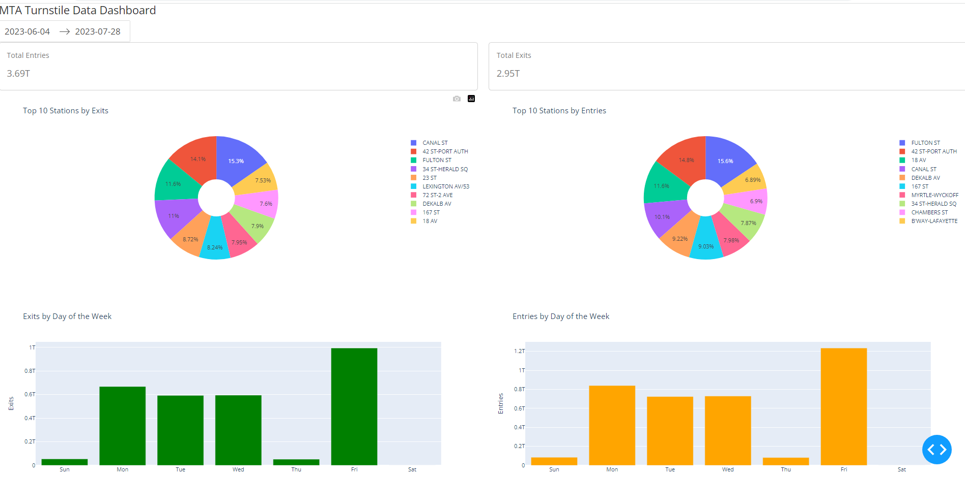
Once the implementation of this Python dashboard is complete, we can run it and see the following dashboard load on our browser:

Requirements
These are the requirements to be able to run the Python dashboard.
👉 Clone this repo or copy the files from this folder. We could also create a GitHub CodeSpace and run this online.
- Use the analysis_data.csv file for test data
- Use the local file for this implementation
- Install the Python dependencies
- Type the following from the terminal
$ pip install pandas
$ pip install plotly
$ pip install dash
$ pip install dash_bootstrap_components
How to Run It
After installing the dependencies and downloading the code, we should be able to run the code from a terminal by typing:
$ python3 dashboard.py
We should note that this is a simple implementation to illustrate the amount of effort it takes to build a dashboard using code. The code uses a local CSV file. If we need to connect to the data warehouse, we need to expand this code to use an API call that is authorized to access the data warehouse. Writing Python dashboards or creating Jupyter charts, works well for small teams that are working closely together and are running experiments on the data. However, for a more enterprise solution, we should look at using a tool like Looker or PowerBI. Let's take a look at that next.
Review the Code - Low-Code
Tools like Looker and PowerBI excel in data visualization, requiring little to no coding. These tools offer a plethora of visual elements for configuring dashboards, minimizing the need for extensive coding. For instance, these platforms effortlessly handle tasks like automatically displaying the day of the week from a date-time field.
In cases where an out-of-the-box solution is lacking, we might need to supplement it with a code snippet. For instance, consider our time range requirement. Since this is quite specific to our project, we must generate a new series with our desired labels. To achieve this, we introduce a new field that corresponds to the date-time hour value. When the field is created, we are essentially implementing a function.
The provided code reads the hour value from the date-time fields and subsequently maps it to its corresponding label.
CASE
    WHEN HOUR(created_dt) BETWEEN 0 AND 3 THEN "12:00-3:59am"
    WHEN HOUR(created_dt) BETWEEN 4 AND 7 THEN "04:00-7:59am"
    WHEN HOUR(created_dt) BETWEEN 8 AND 11 THEN "08:00-11:59am"
    WHEN HOUR(created_dt) BETWEEN 12 AND 15 THEN "12:00-3:59pm"
    WHEN HOUR(created_dt) BETWEEN 16 AND 20 THEN "04:00-7:59pm"
    WHEN HOUR(created_dt) BETWEEN 20 AND 23 THEN "08:00-11:59pm"
END
Requirements
The only requirement here is to sign up with Looker Studio and have access to a data warehouse or database that can serve data and is accessible from external sources.
Other Visualizations tools:
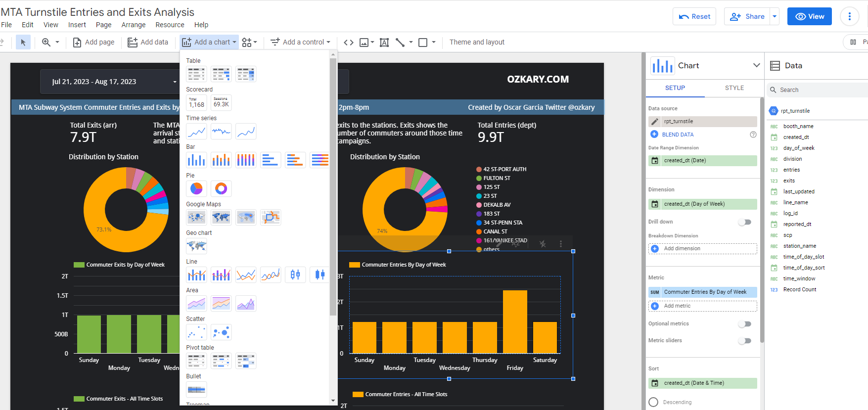
Looker UI
Take a look at the image below. This is the Looker UI. We should familiarize ourselves with the following areas:

- Theme and Layout: Use it to configure the theme and change the layout for mobile or desktop
- Add data: Use this to add a new data source
- Add a chart: This allows us to add new charts
- Add a control: Here, we can add the date range and station name list
- Canvas: This is where we place all the components
- Setup Pane: This allows us to configure the date range, dimension, measures, and sorting settings
- Style Pane: Here, we can configure the colors and font
- Data Pane: This displays the data sources with their fields. New fields are created as functions. When we hover over a field, we can see a function (fx) icon, which indicates that we can edit the function and configure our snippet
How to Build it
Sign up for a Looker account or use another BI tool and follow these steps:
- Create a new dashboard
- Click on the "Add Data" button
- Use the connector for our data source:
- This should allow us to configure the credentials for access
- Select the "rpt_turnstile" view, which already includes joins with the fact_table and dimension tables
- Once the data is loaded, we can see the dimensions and measures
- Add the dashboard filters:
- Include a date range control for the filter, using the "created_dt" field
- Add a list control and associate it with the station name
- Proceed to add the remaining charts:
- Ensure that all charts are associated with the date range dimension
- This enables filtering to cascade across all the charts
- Utilize the "entries" and "exits" measures for all dashboards:
- Integrate two scorecards for the sum of entries and exits
- Incorporate a donut chart to display exits and entries distribution by stations
- Incorporate two bar charts (entries and exits) and use the weekday value from the "created_dt" dimension
- Sort them by the weekday. Use the day number (0-6), not the name (Sun-Sat). This is achieved by adding a new field with the following code and using it for sorting:
WEEKDAY(created_dt)
- Create the time slot dimension field (click "Add Field" and enter this definition):
CASE
    WHEN HOUR(created_dt) BETWEEN 0 AND 3 THEN "12:00-3:59am"
    WHEN HOUR(created_dt) BETWEEN 4 AND 7 THEN "04:00-7:59am"
    WHEN HOUR(created_dt) BETWEEN 8 AND 11 THEN "08:00-11:59am"
    WHEN HOUR(created_dt) BETWEEN 12 AND 15 THEN "12:00-3:59pm"
    WHEN HOUR(created_dt) BETWEEN 16 AND 19 THEN "04:00-7:59pm"
    WHEN HOUR(created_dt) BETWEEN 20 AND 23 THEN "08:00-11:59pm"
END
- Add two bar charts (entries and exits) and use the time slot dimension:
- Use the hour value from the "created_dt" dimension for sorting by adding a new field and using it as your sorting criteria:
HOUR(created_dt)
View the Dashboard
After following all the specification, we should be able to preview the dashboard on the browser. We can load an example, of a dashboard by clicking on the link below:
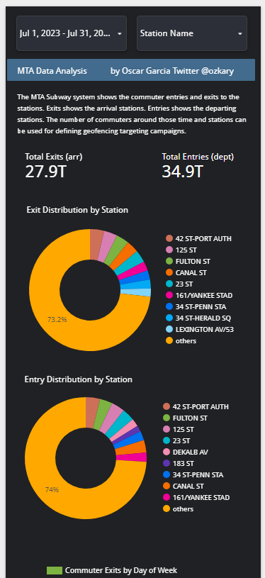
This is a an image of the mobile dashboard.

Data Analysis Conclusions
By examining the dashboard, the following conclusions can be observed:
- Stations with the highest distribution represent the busiest locations
- The busiest time slot for both exits and entries is between 4pm and 9pm
- Every day of the week exhibits a high volume of commuters
- Businesses can choose the stations near their locations for further analysis
With these insights, strategies can be devised to optimize marketing campaigns and target users within geo-fenced areas and during specific hours of the day that are in close proximity to corresponding business locations.
Summary
We utilize our expertise in data analysis and visualization to construct charts and build them into dashboards. We adopt two distinct approaches for dashboard creation: a code-centric method and a low-code enterprise solution like Looker. After a comprehensive comparison, we deduce that the code-centric approach is optimal for small teams, whereas it might not suffice for enterprise users, especially when targeting executive stakeholders.
Lastly, as the dashboard becomes operational, we transition into the role of business analysts, deciphering insights from the data. This enables us to offer answers aligned with our original requirements.
Next
We have successfully completed our data pipeline from CSV files to our data warehouse and dashboard. Now, let's explore an advanced concept in data engineering: data streaming, which facilitates real-time data integration. This involves the continuous and timely processing of incoming data. Technologies like Apache Kafka and Apache Spark play a crucial role in enabling efficient data streaming processes. Let's take a closer look at these components next.
Coming Soon!
👉 [Data Engineering Process Fundamentals - Real-Time Data]
Thanks for reading.
Send question or comment at Twitter @ozkary
👍 Originally published by ozkary.com


0 comments :
Post a Comment
What do you think?