Showing posts with label jupyter notebook. Show all posts

8/27/25

From Raw Data to Roadmap: The Discovery Phase in Data Engineering Process Fundamentals

Overview

The discovery process involves identifying the problem, analyzing data sources, defining project requirements, establishing the project scope, and designing an effective architecture to address the identified challenges.

In this session, we will delve into the essential building blocks of data engineering, placing a spotlight on the discovery process. From framing the problem statement to navigating the intricacies of exploratory data analysis (EDA) using Python, VSCode, Jupyter Notebooks, and GitHub, you'll gain a solid understanding of the fundamental aspects that drive effective data engineering projects.

DevFest Series Data Engineering Process Fundamentals Series

From Raw Data to Roadmap: The Discovery Phase in Data Engineering - Data Engineering Process Fundamentals

  • Follow this GitHub repo during the presentation: (Give it a star)

👉 GitHub Repo

Jupyter Notebook

👉 Jupyter Notebook

  • Data engineering Series:

👉 Blog Series

👉 Data Engineering Book on Amazon

YouTube Video

Video Agenda

In this session, we will delve into the essential building blocks of data engineering, placing a spotlight on the discovery process. From framing the problem statement to navigating the intricacies of exploratory data analysis (EDA), data modeling using Python, VS Code, Jupyter Notebooks, SQL, and GitHub, you'll gain a solid understanding of the fundamental aspects that drive effective data engineering projects.

  1. Introduction:

    • The "Why": We'll discuss why understanding your data upfront is crucial for success.
    • The Problem: We'll introduce a real-world problem that will guide our exploration.
  2. Data Loading and Preparation:

    • Loading: We'll demonstrate how to efficiently load data from an online source directly into our workspace.
    • Structuring: We'll prepare the loaded data for analysis, making it easy to work with.
  3. Exploratory Data Analysis (EDA):

    • First Look: We'll learn how to quickly generate and interpret summary statistics for our data.
    • The Story: We'll use these statistics to understand the data's characteristics and identify any red flags or anomalies.
  4. Data Cleaning and Modeling:

    • Cleaning: We'll identify and handle common data issues like missing values and inconsistencies.
    • Modeling: We'll organize our data into separate tables for dimensions (descriptive attributes) and facts (measurable values).
  5. Visualization and Real-World Application:

    • Bringing it to Life: We'll create charts to visualize the data and find patterns.
    • Solving the Problem: We'll apply the insights gained to address our original problem and discuss practical solutions.

Key Takeaways:

  • Mastery of the foundational aspects of data engineering.
  • Hands-on experience with EDA techniques, emphasizing the discovery phase.
  • Appreciation for the value of a code-centric approach in the data engineering discovery process.

Upcoming Talks:

Join us for subsequent sessions in our Data Engineering Process Fundamentals series, where we will delve deeper into specific facets of data engineering, exploring topics such as data modeling, pipelines, and best practices in data governance.

This presentation is based on the book, "Data Engineering Process Fundamentals," which provides a more comprehensive guide to the topics we'll cover. You can find all the sample code and datasets used in this presentation on our popular GitHub repository.

Presentation

Data Engineering Overview

A Data Engineering Process involves executing steps to understand the problem, scope, design, and architecture for creating a solution. This enables ongoing big data analysis using analytical and visualization tools.

Topics

  • Importance of the Discovery Process
  • Setting the Stage - Technologies
  • Exploratory Data Analysis (EDA)
  • Code-Centric Approach
  • Version Control
  • Real-World Use Case

Follow this project: Give a star

👉 Data Engineering Process Fundamentals

Importance of the Discovery Process

The discovery process involves identifying the problem, analyzing data sources, defining project requirements, establishing the project scope, and designing an effective architecture to address the identified challenges.

  • Clearly document the problem statement to understand the challenges the project aims to address.
  • Make observations about the data, its structure, and sources during the discovery process.
  • Define project requirements based on the observations, enabling the team to understand the scope and goals.
  • Clearly outline the scope of the project, ensuring a focused and well-defined set of objectives.
  • Use insights from the discovery phase to inform the design of the solution, including data architecture.
  • Develop a robust project architecture that aligns with the defined requirements and scope.

Data Engineering Process Fundamentals - Discovery Process

Setting the Stage - Technologies

To set the stage, we need to identify and select the tools that can facilitate the analysis and documentation of the data. Here are key technologies that play a crucial role in this stage:

  • Python: A versatile programming language with rich libraries for data manipulation, analysis, and scripting.

Use Cases: Data download, cleaning, exploration, and scripting for automation.

  • Jupyter Notebooks: An interactive tool for creating and sharing documents containing live code, visualizations, and narrative text.

Use Cases: Exploratory data analysis, documentation, and code collaboration.

  • Visual Studio Code: A lightweight, extensible code editor with powerful features for source code editing and debugging.

Use Cases: Writing and debugging code, integrating with version control systems like GitHub.

  • SQL (Structured Query Language): A domain-specific language for managing and manipulating relational databases.

Use Cases: Querying databases, data extraction, and transformation.

Data Engineering Process Fundamentals - Discovery Tools

Exploratory Data Analysis (EDA)

EDA is our go-to method for downloading, analyzing, understanding and documenting the intricacies of the datasets. It's like peeling back the layers of information to reveal the stories hidden within the data. Here's what EDA is all about:

  • EDA is the process of analyzing data to identify patterns, relationships, and anomalies, guiding the project's direction.

  • Python and Jupyter Notebook collaboratively empower us to download, describe, and transform data through live queries.

  • Insights gained from EDA set the foundation for informed decision-making in subsequent data engineering steps.

  • Code written on Jupyter Notebook can be exported and used as the starting point for components for the data pipeline and transformation services.

Data Engineering Process Fundamentals - Discovery Pie Chart

Code-Centric Approach

A code-centric approach, using programming languages and tools in EDA, helps us understand the coding methodology for building data structures, defining schemas, and establishing relationships. This robust understanding seamlessly guides project implementation.

  • Code delves deep into data intricacies, revealing integration and transformation challenges often unclear with visual tools.

  • Using code taps into Pandas and Numpy libraries, empowering robust manipulation of data frames, establishment of loading schemas, and addressing transformation needs.

  • Code-centricity enables sophisticated analyses, covering aggregation, distribution, and in-depth examinations of the data.

  • While visual tools have their merits, a code-centric approach excels in hands-on, detailed data exploration, uncovering subtle nuances and potential challenges.

Data Engineering Process Fundamentals - Discovery Pie Chart

Version Control

Using a tool like GitHub is essential for effective version control and collaboration in our discovery process. GitHub enables us to track our exploratory code and Jupyter Notebooks, fostering collaboration, documentation, and comprehensive project management. Here's how GitHub enhances our process:

  • Centralized Tracking: GitHub centralizes tracking and managing our exploratory code and Jupyter Notebooks, ensuring a transparent and organized record of our data exploration.

  • Sharing: Easily share code and Notebooks with team members on GitHub, fostering seamless collaboration and knowledge sharing.

  • Documentation: GitHub supports Markdown, enabling comprehensive documentation of processes, findings, and insights within the same repository.

  • Project Management: GitHub acts as a project management hub, facilitating CI/CD pipeline integration for smooth and automated delivery of data engineering projects.

Data Engineering Process Fundamentals - Discovery Problem Statement

Summary: The Power of Discovery

By mastering the discovery phase, you lay a strong foundation for successful data engineering projects. A thorough understanding of your data is essential for extracting meaningful insights.

  • Understanding Your Data: The discovery phase is crucial for understanding your data's characteristics, quality, and potential.
  • Exploratory Data Analysis (EDA): Use techniques to uncover patterns, trends, and anomalies.
  • Data Profiling: Assess data quality, identify missing values, and understand data distributions.
  • Data Cleaning: Address data inconsistencies and errors to ensure data accuracy.
  • Domain Knowledge: Leverage domain expertise to guide data exploration and interpretation.
  • Setting the Stage: Choose the right language and tools for efficient data exploration and analysis.

The data engineering discovery process involves defining the problem statement, gathering requirements, and determining the scope of work. It also includes a data analysis exercise utilizing Python and Jupyter Notebooks or other tools to extract valuable insights from the data. These steps collectively lay the foundation for successful data engineering endeavors.

Thanks for reading! 😊 If you enjoyed this post and would like to stay updated with our latest content, don’t forget to follow us. Join our community and be the first to know about new articles, exclusive insights, and more!

👍 Originally published by ozkary.com

10/31/24

A Hands-On Exploration into the discovery phase - Data Engineering Process Fundamentals

Overview

The discovery process involves identifying the problem, analyzing data sources, defining project requirements, establishing the project scope, and designing an effective architecture to address the identified challenges.

In this session, we will delve into the essential building blocks of data engineering, placing a spotlight on the discovery process. From framing the problem statement to navigating the intricacies of exploratory data analysis (EDA) using Python, VSCode, Jupyter Notebooks, and GitHub, you'll gain a solid understanding of the fundamental aspects that drive effective data engineering projects.

A Hands-On Exploration into the discovery phase - Data Engineering Process Fundamentals

  • Follow this GitHub repo during the presentation: (Give it a star)

👉 https://github.com/ozkary/data-engineering-mta-turnstile

Jupyter Notebook

👉 https://github.com/ozkary/data-engineering-mta-turnstile/blob/main/Step1-Discovery/mta_discovery.ipynb

  • Data engineering Series:

👉 https://www.ozkary.com/2023/03/data-engineering-process-fundamentals.html

Jupyter Notebook Preview

# Standard library imports
from time import time
from pathlib import Path
import requests
from io import StringIO
# Load pandas support for data analysis tasks, dataframe (two-dimensional data structure with rows and columns) management
import pandas as pd    
import numpy as np 

# URL of the file you want to download. Note: It should be a Saturday date
url = 'http://web.mta.info/developers/data/nyct/turnstile/turnstile_241026.txt'

# Download the file in memory
response = requests.get(url)
response.raise_for_status()  # Check if the request was successful

# Create a DataFrame from the downloaded content
data = StringIO(response.text)
df = pd.read_csv(data)

# Display the DataFrame first 10 rows
df.head(10)

# use info to get the column names, data type and null values
df.info()

# remove spaces and type case the columns
df.columns = [column.strip() for column in df.columns]
print(df.columns)
df["ENTRIES"] = df["ENTRIES"].astype(int)
df["EXITS"] = df["EXITS"].astype(int)

# Define the set of special characters you want to check for
special_characters_set = set('@#$%/')


def has_special_characters(col, special_characters):
    # Check if any character in the column name is not alphanumeric or in the specified set
    return any(char in special_characters for char in col)

def rename_columns(df, special_characters_set):
    # Create a mapping of old column names to new column names
    mapping = {col: ''.join(char for char in col if char.isalnum() or char not in special_characters_set) for col in df.columns}

    print(mapping)
    # Rename columns using the mapping
    df_renamed = df.rename(columns=mapping)

    return df_renamed


# Identify columns with special characters using list comprehension syntax
columns_with_special_characters = [col for col in df.columns if has_special_characters(col, special_characters_set)]

# Print the result
print("Columns with special characters:", columns_with_special_characters)

# Identify columns with special characters and rename them
df = rename_columns(df, special_characters_set)

# Display the data frame again. there should be no column name with special characters
print(df.info())

YouTube Video

Video Agenda

  1. Introduction:

    • Unveiling the importance of the discovery process in data engineering.

    • Setting the stage with a real-world problem statement that will guide our exploration.

  2. Setting the Stage:

    • Downloading and comprehending sample data to kickstart our discovery journey.

    • Configuring the development environment with VSCode and Jupyter Notebooks.

  3. Exploratory Data Analysis (EDA):

    • Delving deep into EDA techniques with a focus on the discovery phase.

    • Demonstrating practical approaches using Python to uncover insights within the data.

  4. Code-Centric Approach:

    • Advocating the significance of a code-centric approach during the discovery process.

    • Showcasing how a code-centric mindset enhances collaboration, repeatability, and efficiency.

  5. Version Control with GitHub:

    • Integrating GitHub seamlessly into our workflow for version control and collaboration.

    • Managing changes effectively to ensure a streamlined data engineering discovery process.

  6. Real-World Application:

    • Applying insights gained from EDA to address the initial problem statement.

    • Discussing practical solutions and strategies derived from the discovery process.

Key Takeaways:

  • Mastery of the foundational aspects of data engineering.

  • Hands-on experience with EDA techniques, emphasizing the discovery phase.

  • Appreciation for the value of a code-centric approach in the data engineering discovery process.

Some of the technologies that we will be covering:

  • Python
  • Data Analysis and Visualization
  • Jupyter Notebook
  • Visual Studio Code

Presentation

Data Engineering Overview

A Data Engineering Process involves executing steps to understand the problem, scope, design, and architecture for creating a solution. This enables ongoing big data analysis using analytical and visualization tools.

Topics

  • Importance of the Discovery Process
  • Setting the Stage - Technologies
  • Exploratory Data Analysis (EDA)
  • Code-Centric Approach
  • Version Control
  • Real-World Use Case

Follow this project: Give a star

👉 Data Engineering Process Fundamentals

Importance of the Discovery Process

The discovery process involves identifying the problem, analyzing data sources, defining project requirements, establishing the project scope, and designing an effective architecture to address the identified challenges.

  • Clearly document the problem statement to understand the challenges the project aims to address.
  • Make observations about the data, its structure, and sources during the discovery process.
  • Define project requirements based on the observations, enabling the team to understand the scope and goals.
  • Clearly outline the scope of the project, ensuring a focused and well-defined set of objectives.
  • Use insights from the discovery phase to inform the design of the solution, including data architecture.
  • Develop a robust project architecture that aligns with the defined requirements and scope.

Data Engineering Process Fundamentals - Discovery Process

Setting the Stage - Technologies

To set the stage, we need to identify and select the tools that can facilitate the analysis and documentation of the data. Here are key technologies that play a crucial role in this stage:

  • Python: A versatile programming language with rich libraries for data manipulation, analysis, and scripting.

Use Cases: Data download, cleaning, exploration, and scripting for automation.

  • Jupyter Notebooks: An interactive tool for creating and sharing documents containing live code, visualizations, and narrative text.

Use Cases: Exploratory data analysis, documentation, and code collaboration.

  • Visual Studio Code: A lightweight, extensible code editor with powerful features for source code editing and debugging.

Use Cases: Writing and debugging code, integrating with version control systems like GitHub.

  • SQL (Structured Query Language): A domain-specific language for managing and manipulating relational databases.

Use Cases: Querying databases, data extraction, and transformation.

Data Engineering Process Fundamentals - Discovery Tools

Exploratory Data Analysis (EDA)

EDA is our go-to method for downloading, analyzing, understanding and documenting the intricacies of the datasets. It's like peeling back the layers of information to reveal the stories hidden within the data. Here's what EDA is all about:

  • EDA is the process of analyzing data to identify patterns, relationships, and anomalies, guiding the project's direction.

  • Python and Jupyter Notebook collaboratively empower us to download, describe, and transform data through live queries.

  • Insights gained from EDA set the foundation for informed decision-making in subsequent data engineering steps.

  • Code written on Jupyter Notebook can be exported and used as the starting point for components for the data pipeline and transformation services.

Data Engineering Process Fundamentals - Discovery Pie Chart

Code-Centric Approach

A code-centric approach, using programming languages and tools in EDA, helps us understand the coding methodology for building data structures, defining schemas, and establishing relationships. This robust understanding seamlessly guides project implementation.

  • Code delves deep into data intricacies, revealing integration and transformation challenges often unclear with visual tools.

  • Using code taps into Pandas and Numpy libraries, empowering robust manipulation of data frames, establishment of loading schemas, and addressing transformation needs.

  • Code-centricity enables sophisticated analyses, covering aggregation, distribution, and in-depth examinations of the data.

  • While visual tools have their merits, a code-centric approach excels in hands-on, detailed data exploration, uncovering subtle nuances and potential challenges.

Data Engineering Process Fundamentals - Discovery Pie Chart

Version Control

Using a tool like GitHub is essential for effective version control and collaboration in our discovery process. GitHub enables us to track our exploratory code and Jupyter Notebooks, fostering collaboration, documentation, and comprehensive project management. Here's how GitHub enhances our process:

  • Centralized Tracking: GitHub centralizes tracking and managing our exploratory code and Jupyter Notebooks, ensuring a transparent and organized record of our data exploration.

  • Sharing: Easily share code and Notebooks with team members on GitHub, fostering seamless collaboration and knowledge sharing.

  • Documentation: GitHub supports Markdown, enabling comprehensive documentation of processes, findings, and insights within the same repository.

  • Project Management: GitHub acts as a project management hub, facilitating CI/CD pipeline integration for smooth and automated delivery of data engineering projects.

Data Engineering Process Fundamentals - Discovery Problem Statement

Summary: The Power of Discovery

By mastering the discovery phase, you lay a strong foundation for successful data engineering projects. A thorough understanding of your data is essential for extracting meaningful insights.

  • Understanding Your Data: The discovery phase is crucial for understanding your data's characteristics, quality, and potential.
  • Exploratory Data Analysis (EDA): Use techniques to uncover patterns, trends, and anomalies.
  • Data Profiling: Assess data quality, identify missing values, and understand data distributions.
  • Data Cleaning: Address data inconsistencies and errors to ensure data accuracy.
  • Domain Knowledge: Leverage domain expertise to guide data exploration and interpretation.
  • Setting the Stage: Choose the right language and tools for efficient data exploration and analysis.

The data engineering discovery process involves defining the problem statement, gathering requirements, and determining the scope of work. It also includes a data analysis exercise utilizing Python and Jupyter Notebooks or other tools to extract valuable insights from the data. These steps collectively lay the foundation for successful data engineering endeavors.

Thanks for reading.

Send question or comment at Twitter @ozkary 👍 Originally published by ozkary.com

1/31/24

Decoding Data: A Journey into the Discovery Phase - Data Engineering Process Fundamentals

Overview

The discovery process involves identifying the problem, analyzing data sources, defining project requirements, establishing the project scope, and designing an effective architecture to address the identified challenges.

In this session, we will delve into the essential building blocks of data engineering, placing a spotlight on the discovery process. From framing the problem statement to navigating the intricacies of exploratory data analysis (EDA) using Python, VSCode, Jupyter Notebooks, and GitHub, you'll gain a solid understanding of the fundamental aspects that drive effective data engineering projects.

Data Engineering Process Fundamentals - Discovery Phase

  • Follow this GitHub repo during the presentation: (Give it a star)

👉 https://github.com/ozkary/data-engineering-mta-turnstile

  • Read more information on my blog at:

👉 https://www.ozkary.com/2023/03/data-engineering-process-fundamentals.html

YouTube Video

Video Agenda

  1. Introduction:

    • Unveiling the importance of the discovery process in data engineering.

    • Setting the stage with a real-world problem statement that will guide our exploration.

  2. Setting the Stage:

    • Downloading and comprehending sample data to kickstart our discovery journey.

    • Configuring the development environment with VSCode and Jupyter Notebooks.

  3. Exploratory Data Analysis (EDA):

    • Delving deep into EDA techniques with a focus on the discovery phase.

    • Demonstrating practical approaches using Python to uncover insights within the data.

  4. Code-Centric Approach:

    • Advocating the significance of a code-centric approach during the discovery process.

    • Showcasing how a code-centric mindset enhances collaboration, repeatability, and efficiency.

  5. Version Control with GitHub:

    • Integrating GitHub seamlessly into our workflow for version control and collaboration.

    • Managing changes effectively to ensure a streamlined data engineering discovery process.

  6. Real-World Application:

    • Applying insights gained from EDA to address the initial problem statement.

    • Discussing practical solutions and strategies derived from the discovery process.

Key Takeaways:

  • Mastery of the foundational aspects of data engineering.

  • Hands-on experience with EDA techniques, emphasizing the discovery phase.

  • Appreciation for the value of a code-centric approach in the data engineering discovery process.

Some of the technologies that we will be covering:

  • Python
  • Data Analysis and Visualization
  • Jupyter Notebook
  • Visual Studio Code

Presentation

Data Engineering Overview

A Data Engineering Process involves executing steps to understand the problem, scope, design, and architecture for creating a solution. This enables ongoing big data analysis using analytical and visualization tools.

Topics

  • Importance of the Discovery Process
  • Setting the Stage - Technologies
  • Exploratory Data Analysis (EDA)
  • Code-Centric Approach
  • Version Control
  • Real-World Use Case

Follow this project: Give a star

👉 Data Engineering Process Fundamentals

Importance of the Discovery Process

The discovery process involves identifying the problem, analyzing data sources, defining project requirements, establishing the project scope, and designing an effective architecture to address the identified challenges.

  • Clearly document the problem statement to understand the challenges the project aims to address.
  • Make observations about the data, its structure, and sources during the discovery process.
  • Define project requirements based on the observations, enabling the team to understand the scope and goals.
  • Clearly outline the scope of the project, ensuring a focused and well-defined set of objectives.
  • Use insights from the discovery phase to inform the design of the solution, including data architecture.
  • Develop a robust project architecture that aligns with the defined requirements and scope.

Data Engineering Process Fundamentals - Discovery Process

Setting the Stage - Technologies

To set the stage, we need to identify and select the tools that can facilitate the analysis and documentation of the data. Here are key technologies that play a crucial role in this stage:

  • Python: A versatile programming language with rich libraries for data manipulation, analysis, and scripting.

Use Cases: Data download, cleaning, exploration, and scripting for automation.

  • Jupyter Notebooks: An interactive tool for creating and sharing documents containing live code, visualizations, and narrative text.

Use Cases: Exploratory data analysis, documentation, and code collaboration.

  • Visual Studio Code: A lightweight, extensible code editor with powerful features for source code editing and debugging.

Use Cases: Writing and debugging code, integrating with version control systems like GitHub.

  • SQL (Structured Query Language): A domain-specific language for managing and manipulating relational databases.

Use Cases: Querying databases, data extraction, and transformation.

Data Engineering Process Fundamentals - Discovery Tools

Exploratory Data Analysis (EDA)

EDA is our go-to method for downloading, analyzing, understanding and documenting the intricacies of the datasets. It's like peeling back the layers of information to reveal the stories hidden within the data. Here's what EDA is all about:

  • EDA is the process of analyzing data to identify patterns, relationships, and anomalies, guiding the project's direction.

  • Python and Jupyter Notebook collaboratively empower us to download, describe, and transform data through live queries.

  • Insights gained from EDA set the foundation for informed decision-making in subsequent data engineering steps.

  • Code written on Jupyter Notebook can be exported and used as the starting point for components for the data pipeline and transformation services.

Data Engineering Process Fundamentals - Discovery Pie Chart

Code-Centric Approach

A code-centric approach, using programming languages and tools in EDA, helps us understand the coding methodology for building data structures, defining schemas, and establishing relationships. This robust understanding seamlessly guides project implementation.

  • Code delves deep into data intricacies, revealing integration and transformation challenges often unclear with visual tools.

  • Using code taps into Pandas and Numpy libraries, empowering robust manipulation of data frames, establishment of loading schemas, and addressing transformation needs.

  • Code-centricity enables sophisticated analyses, covering aggregation, distribution, and in-depth examinations of the data.

  • While visual tools have their merits, a code-centric approach excels in hands-on, detailed data exploration, uncovering subtle nuances and potential challenges.

Data Engineering Process Fundamentals - Discovery Pie Chart

Version Control

Using a tool like GitHub is essential for effective version control and collaboration in our discovery process. GitHub enables us to track our exploratory code and Jupyter Notebooks, fostering collaboration, documentation, and comprehensive project management. Here's how GitHub enhances our process:

  • Centralized Tracking: GitHub centralizes tracking and managing our exploratory code and Jupyter Notebooks, ensuring a transparent and organized record of our data exploration.

  • Sharing: Easily share code and Notebooks with team members on GitHub, fostering seamless collaboration and knowledge sharing.

  • Documentation: GitHub supports Markdown, enabling comprehensive documentation of processes, findings, and insights within the same repository.

  • Project Management: GitHub acts as a project management hub, facilitating CI/CD pipeline integration for smooth and automated delivery of data engineering projects.

Data Engineering Process Fundamentals - Discovery Problem Statement

Summary

The data engineering discovery process involves defining the problem statement, gathering requirements, and determining the scope of work. It also includes a data analysis exercise utilizing Python and Jupyter Notebooks or other tools to extract valuable insights from the data. These steps collectively lay the foundation for successful data engineering endeavors.

Thanks for reading.

Send question or comment at Twitter @ozkary

👍 Originally published by ozkary.com

12/2/23

AI - A Learning Based Approach For Predicting Heart Disease

Abstract

Heart disease is a leading cause of mortality worldwide, and its early identification and risk assessment are critical for effective prevention and intervention. With the help of electronic health records (EHR) and a wealth of health-related data, there is a significant opportunity to leverage machine learning techniques for predicting and assessing the risk of heart disease in individuals.

ozkary-ai-engineering-heart-disease

The United States Centers for Disease Control and Prevention (CDC) has been collecting a vast array of data on demographics, lifestyle, medical history, and clinical parameters. This data repository offers a valuable resource to develop predictive models that can help identify those at risk of heart disease before symptoms manifest.

This study aims to use machine learning models to predict an individual's likelihood of developing heart disease based on CDC data. By employing advanced algorithms and data analysis, we seek to create a predictive model that factors in various attributes such as age, gender, cholesterol levels, blood pressure, smoking habits, and other relevant health indicators. The solution could assist healthcare professionals in evaluating an individual's risk profile for heart disease.

Key Objectives

Key objectives of this study include:

  1. Developing a robust machine learning model capable of accurately predicting the risk of heart disease using CDC data.
  2. Identifying the most influential risk factors and parameters contributing to heart disease prediction.
  3. Compare model performance:
    • Logistic Regression
    • Decision Tree
    • Random Forest
    • XGBoost Classification
  4. Evaluating the following metrics
    • Accuracy
    • Precision,
    • F1
    • Recall
  5. Providing an API, so tools can integrate and make a risk analysis.
    • Build a local app
    • Build an Azure function for cloud deployment

The successful implementation of this study will lead to a transformative impact on public health by enabling timely preventive measures and tailored interventions for individuals at risk of heart disease.

Conclusion

This study was conducted by using four different Machine Learning algorithm. After comparing the performance of all these models, we concluded that the XGBoost Model has a relatively balanced precision and recall metrics, indicating that it's better at identifying true positives while keeping false positives in check. Based on this analysis, we choose XGBoost as the best performing model for this type of analysis.

Machine Learning Engineering Process

In order to execute this project, we follow a series of steps for discovery and data analysis, data processing and model selection. This process is done using jupyter notebooks for the experimental phase, and python files for the implementation and delivery phase.

Experimental Phase Notebooks

👉 The data files for this study can be found in the same GitHub project as the Jupyter Notebook files.

Data Analysis - Exploratory Data Analysis (EDA)

These are the steps to analysis the data:

  • Load the data/2020/heart_2020_cleaned.csv
  • Fill in the missing values with zero
  • Review the data
    • Rename the columns to lowercase
    • Check the data types
    • Preview the data
  • Identify the features
    • Identify the categorical and numeric features
    • Identify the target variables
  • Remove duplicates
  • Identify categorical features that can be converted into binary
  • Check the class balance in the data
    • Check for Y/N labels for heart disease identification

Features

Based on the dataset, we have a mix of categorical and numerical features. We consider the following for encoding:

  1. Categorical Features:

    • 'heartdisease': This is the target variable. We remove this feature for the model training.
    • 'smoking', 'alcoholdrinking', 'stroke', 'sex', 'agecategory', 'race', 'diabetic', 'physicalactivity', 'genhealth', 'sleeptime', 'asthma', 'kidneydisease', 'skincancer': These are categorical features. We can consider one-hot encoding these features.
  2. Numerical Features:

    • 'bmi', 'physicalhealth', 'mentalhealth', 'diffwalking': These are already numerical features, so there's no need to encode them.
# get a list of numeric features
features_numeric = list(df.select_dtypes(include=[np.number]).columns)

# get a list of object features and exclude the target feature 'heartdisease'
features_category = list(df.select_dtypes(include=['object']).columns)

# remove the target feature from the list of categorical features
target = 'heartdisease'

features_category.remove(target)

print('Categorical features',features_category)
print('Numerical features',features_numeric)

Data Validation and Class Balance

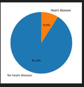
The data shows imbalance for the Y/N classes. There are less cases of heart disease, as expected, than the rest of the population. This can result in low performing models as there is way more negatives cases (N). To account for that, we can use techniques like down sampling the negative cases.

Heart Disease Distribution

# plot a distribution of the target variable set labels for each bar chart and show the count
print(df[target].value_counts(normalize=True).round(2))

# plot the distribution of the target variable
df[target].value_counts().plot(kind='bar', rot=0)
plt.xlabel('Heart disease')
plt.ylabel('Count')
# add a count label to each bar
for i, count in enumerate(df[target].value_counts()):
    plt.text(i, count-50, count, ha='center', va='top', fontweight='bold')

plt.show()

# # get the percentage of people with heart disease on a pie chart
df[target].value_counts(normalize=True).plot(kind='pie', labels=['No heart disease', 'Heart disease'], autopct='%1.1f%%', startangle=90)
plt.ylabel('')
plt.show()

👉 No 91% Yes 9%

Heart Disease Class Balance

Data Processing

For data processing, we should follow these steps:

  • Load the data/2020/heart_2020_eda.csv
  • Process the values
    • Convert Yes/No features to binary (1/0)
    • Cast all the numeric values to int to avoid float problems
  • Process the features
    • Set the categorical features names
    • Set the numeric features names
    • Set the target variable
  • Feature importance analysis
    • Use statistical analysis to get the metrics like risk and ratio
    • Mutual Information score

Feature Analysis

The purpose of feature analysis in heart disease study is to uncover the relationships and associations between various patient characteristics (features) and the occurrence of heart disease. By examining factors such as lifestyle, medical history, demographics, and more, we aim to identify which specific attributes or combinations of attributes are most strongly correlated with heart disease. Feature analysis allows for the discovery of risk factors and insights that can inform prevention and early detection strategies.

# Calculate the mean and count of heart disease occurrences per feature value
feature_importance = []

# Create a dataframe for the analysis
results = pd.DataFrame(columns=['Feature', 'Value', 'Percentage'])

for feature in all_features:    
    grouped = df.groupby(feature)[target].mean().reset_index()
    grouped.columns = ['Value', 'Percentage']
    grouped['Feature'] = feature
    results = pd.concat([results, grouped], axis=0)

# Sort the results by percentage in descending order and get the top 10
results = results.sort_values(by='Percentage', ascending=False).head(15)

# get the overall heart diease occurrence rate
overall_rate = df[target].mean()
print('Overall Rate',overall_rate)

# calculate the difference between the feature value percentage and the overall rate
results['Difference'] = results['Percentage'] - overall_rate

# calculate the ratio of the difference to the overall rate
results['Ratio'] = results['Difference'] / overall_rate

# calculate the risk of heart disease occurrence for each feature value
results['Risk'] = results['Percentage'] / overall_rate

# sort the results by ratio in descending order
results = results.sort_values(by='Risk', ascending=False)

print(results)

# Visualize the rankings (e.g., create a bar plot)
import matplotlib.pyplot as plt
import seaborn as sns

plt.figure(figsize=(12, 6))
sns.barplot(data=results, x='Percentage', y='Value', hue='Feature')
plt.xlabel('Percentage of Heart Disease Occurrences')
plt.ylabel('Feature Value')
plt.title('Top 15 Ranking of Feature Values by Heart Disease Occurrence')
plt.show()

Overall Rate 0.09035
           Feature Value  Percentage  Difference     Ratio      Risk
65             bmi    77    0.400000    0.309647  3.427086  4.427086
1           stroke     1    0.363810    0.273457  3.026542  4.026542
3        genhealth  Poor    0.341131    0.250778  2.775537  3.775537
68             bmi    80    0.333333    0.242980  2.689239  3.689239
18       sleeptime    19    0.333333    0.242980  2.689239  3.689239
71             bmi    83    0.333333    0.242980  2.689239  3.689239
21       sleeptime    22    0.333333    0.242980  2.689239  3.689239
1    kidneydisease     1    0.293308    0.202956  2.246254  3.246254
29  physicalhealth    29    0.289216    0.198863  2.200957  3.200957

Heart Disease Feature Importance

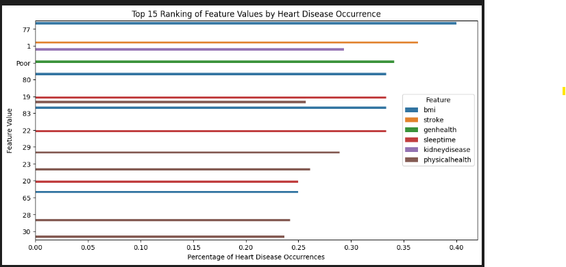
  1. Overall Rate: This is the overall rate of heart disease occurrence in the dataset. It represents the proportion of individuals with heart disease (target='Yes') in the dataset. For example, if the overall rate is 0.2, it means that 20% of the individuals in the dataset have heart disease.

  2. Difference: This value represents the difference between the percentage of heart disease occurrence for a specific feature value and the overall rate. It tells us how much more or less likely individuals with a particular feature value are to have heart disease compared to the overall population. A positive difference indicates a higher likelihood, while a negative difference indicates a lower likelihood.

  3. Ratio: The ratio represents the difference relative to the overall rate. It quantifies how much the heart disease occurrence for a specific feature value deviates from the overall rate, considering the overall rate as the baseline. A ratio greater than 1 indicates a higher risk compared to the overall population, while a ratio less than 1 indicates a lower risk.

  4. Risk: This metric directly quantifies the likelihood of an event happening for a specific feature value, expressed as a percentage. It's easier to interpret as it directly answers the question: "What is the likelihood of heart disease for individuals with this feature value?"

These values help us understand the relationship between different features and heart disease. Positive differences, ratios greater than 1, and risk values greater than 100% suggest a higher risk associated with a particular feature value, while negative differences, ratios less than 1, and risk values less than 100% suggest a lower risk. This information can be used to identify factors that may increase or decrease the risk of heart disease within the dataset.

Mutual Information Score

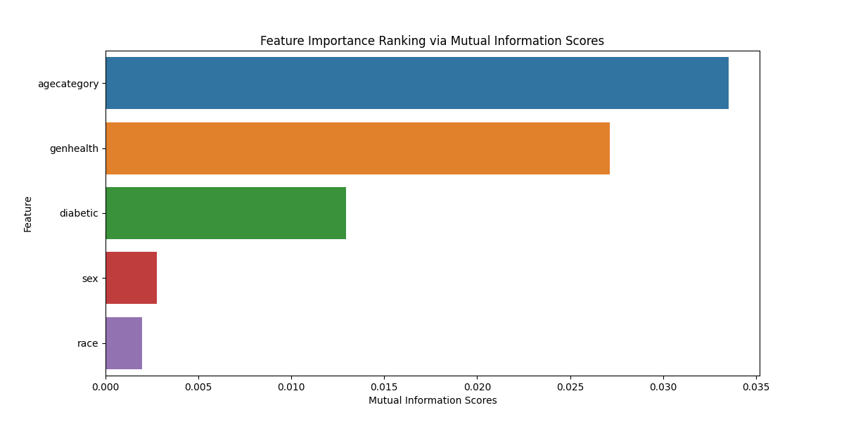
The mutual information score measures the dependency between a feature and the target variable. Higher scores indicate stronger dependency, while lower scores indicate weaker dependency. A higher score suggests that the feature is more informative when predicting the target variable.

# Compute mutual information scores for each feature
X = df[cat_features]
y = df[target]

def mutual_info_heart_disease_score(series):
    return mutual_info_score(series, y)

mi_scores = X.apply(mutual_info_heart_disease_score)
mi_ranking = pd.Series(mi_scores, index=X.columns).sort_values(ascending=False)

print(mi_ranking)
# Visualize the rankings
plt.figure(figsize=(12, 6))
sns.barplot(x=mi_ranking.values, y=mi_ranking.index)
plt.xlabel('Mutual Information Scores')
plt.ylabel('Feature')
plt.title('Feature Importance Ranking via Mutual Information Scores')
agecategory    0.033523
genhealth      0.027151
diabetic       0.012960
sex            0.002771
race           0.001976

Heart Disease Feature Importance

Machine Learning Training and Model Selection

  • Load the data/2020/heart_2020_processed.csv
  • Process the features
    • Set the categorical features names
    • Set the numeric features names
    • Set the target variable
  • Split the data
    • train/validation/test split with 60%/20%/20% distribution.
    • Random_state 42
    • Use strategy = y to deal with the class imbalanced problem
  • Train the model
    • LogisticRegression
    • RandomForestClassifier
    • XGBClassifier
    • DecisionTreeClassifier
  • Evaluate the models and compare them
    • accuracy_score
    • precision_score
    • recall_score
    • f1_score
  • Confusion Matrix

Data Split

  • Use a 60/20/20 distribution fir train/val/test
  • Random_state 42 to shuffle the data
  • Use strategy = y when there is a class imbalance in the dataset. It helps ensure that the class distribution in both the training and validation (or test) sets closely resembles the original dataset's class distribution
def split_data(self, test_size=0.2, random_state=42):
        """
        Split the data into training and validation sets
        """
        # split the data in train/val/test sets, with 60%/20%/20% distribution with seed 1
        X = self.df[self.all_features]
        y = self.df[self.target_variable]
        X_full_train, X_test, y_full_train, y_test = train_test_split(X, y, test_size=test_size, random_state=random_state, stratify=y)

        # .25 splits the 80% train into 60% train and 20% val
        X_train, X_val, y_train, y_val  = train_test_split(X_full_train, y_full_train, test_size=0.25, random_state=random_state)

        X_train = X_train.reset_index(drop=True)
        X_val = X_val.reset_index(drop=True)
        y_train = y_train.reset_index(drop=True)
        y_val = y_val.reset_index(drop=True)
        X_test = X_test.reset_index(drop=True)
        y_test = y_test.reset_index(drop=True)

        # print the shape of all the data splits
        print('X_train shape', X_train.shape)
        print('X_val shape', X_val.shape)
        print('X_test shape', X_test.shape)
        print('y_train shape', y_train.shape)
        print('y_val shape', y_val.shape)
        print('y_test shape', y_test.shape)

        return X_train, X_val, y_train, y_val, X_test, y_test

X_train, X_val, y_train, y_val, X_test, y_test = train_data.split_data(test_size=0.2, random_state=42)

The split_data call is a method that splits a dataset into training, validation, and test sets. Here's a breakdown of the returned values:

  • X_train: This represents the features (input variables) of the training set. The model will be trained on this data.

  • y_train: This corresponds to the labels (output variable) for the training set. It contains the correct outcomes corresponding to the features in X_train.

  • X_val: These are the features of the validation set. The model's performance is often assessed on this set during training to ensure it generalizes well to new, unseen data.

  • y_val: These are the labels for the validation set. They serve as the correct outcomes for the features in X_val during the evaluation of the model's performance.

  • X_test: These are the features of the test set. The model's final evaluation is typically done on this set to assess its performance on completely unseen data.

  • y_test: Similar to y_val, this contains the labels for the test set. It represents the correct outcomes for the features in X_test during the final evaluation of the model.

Model Training

For model training, we first pre-process the data by taking these steps:

  • preprocess_data
    • The input features X are converted to a dictionary format using the to_dict method with the orientation set to records. This is a common step when working with scikit-learn transformers, as they often expect input data in this format.
    • If is_training is True, it fits a transformer (self.encoder) on the data using the fit_transform method. If False, it transforms the data using the previously fitted transformer (self.encoder.transform). The standardized features are then returned.

We then train the different models:

  • train -This method takes X_train (training features) and y_train (training labels) as parameters. -If the models attribute of the class is None, it initializes a dictionary of machine learning models including logistic regression, random forest, XGBoost, and decision tree classifiers.
def preprocess_data(self, X, is_training=True):      
        """
        Preprocess the data for training or validation
        """  
        X_dict = X.to_dict(orient='records')        

        if is_training:
            X_std = self.encoder.fit_transform(X_dict)            
        else:
            X_std = self.encoder.transform(X_dict)

        # Return the standardized features and target variable
        return X_std

def train(self, X_train, y_train):

      if self.models is None:
          self.models = {
              'logistic_regression': LogisticRegression(C=10, max_iter=1000, random_state=42),
              'random_forest': RandomForestClassifier(n_estimators=100, max_depth=5, random_state=42, n_jobs=-1),
              'xgboost': XGBClassifier(n_estimators=100, max_depth=5, random_state=42, n_jobs=-1),                
              'decision_tree': DecisionTreeClassifier(max_depth=5, random_state=42)
          }

      for model in self.models.keys():
          print('Training model', model)
          self.models[model].fit(X_train, y_train) 

# hot encode the categorical features for the train data
model_factory = HeartDiseaseModelFactory(cat_features, num_features)
X_train_std = model_factory.preprocess_data(X_train[cat_features + num_features], True)

# hot encode the categorical features for the validation data
X_val_std = model_factory.preprocess_data(X_val[cat_features + num_features], False)

# Train the model
model_factory.train(X_train_std, y_train)

Model Evaluation

For the model evaluation, we calculate the following metrics:

  1. Accuracy tells us how often your model is correct. It's the percentage of all predictions that are accurate. For example, an accuracy of 92% is great, while 70% is not good.

  2. Precision is about being precise, not making many mistakes. It's the percentage of positive predictions that were actually correct. For instance, a precision of 90% is great, while 50% is not good.

  3. Recall is about not missing any positive instances. It's the percentage of actual positives that were correctly predicted. A recall of 85% is great, while 30% is not good.

  4. F1 Score is a balance between precision and recall. It's like having the best of both worlds. For example, an F1 score of 80% is great, while 45% is not good.


def evaluate(self, X_val, y_val, threshold=0.5):
        """
        Evaluate the model on the validation data set and return the predictions
        """

        # create a dataframe to store the metrics
        df_metrics = pd.DataFrame(columns=['model', 'accuracy', 'precision', 'recall', 'f1', 'y_pred'])

        # define the metrics to be calculated
        fn_metrics = { 'accuracy': accuracy_score,'precision': precision_score,'recall': recall_score,'f1': f1_score}

        # loop through the models and get its metrics
        for model_name in self.models.keys():

            model = self.models[model_name]

            # The first column (y_pred_proba[:, 0]) is for class 0 ("N")
            # The second column (y_pred_proba[:, 1]) is for class 1 ("Y")            
            y_pred = model.predict_proba(X_val)[:,1]
            # get the binary predictions
            y_pred_binary = np.where(y_pred > threshold, 1, 0)

            # add a new row to the dataframe for each model            
            df_metrics.loc[len(df_metrics)] = [model_name, 0, 0, 0, 0, y_pred_binary]

            # get the row index
            row_index = len(df_metrics)-1

            # Evaluate the model metrics
            for metric in fn_metrics.keys():
                score = fn_metrics[metric](y_val, y_pred_binary)
                df_metrics.at[row_index,metric] = score

        return df_metrics

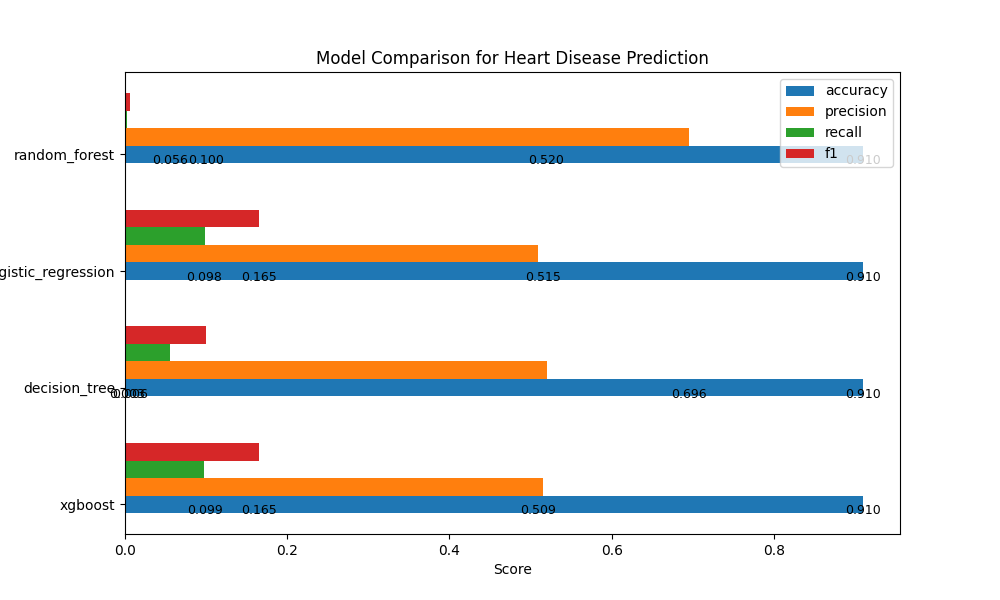
Model Performance Metrics:

Model Accuracy Precision Recall F1
Logistic Regression 0.9097 0.509 0.0987 0.1654
Random Forest 0.9095 0.6957 0.0029 0.0058
XGBoost 0.9099 0.5154 0.098 0.1647
Decision Tree 0.9097 0.5197 0.0556 0.1004

These metrics provide insights into the performance of each model, helping us understand their strengths and areas for improvement.

Analysis:

  • XGBoost Model:

    • Accuracy: 90.99
    • Precision: 51.54%
    • Recall: 9.80%
    • F1 Score: 16.47%
  • Decision Tree Model:

    • Accuracy: 90.97%
    • Precision: 51.97%
    • Recall: 5.56%
    • F1 Score: 10.04%
  • Logistic Regression Model:

    • Accuracy: 90.97%
    • Precision: 50.90%
    • Recall: 9.87%
    • F1 Score: 16.54%
  • Random Forest Model:

    • Accuracy: 90.95%
    • Precision: 69.57%
    • Recall: 0.29%
    • F1 Score: 0.58%
  • XGBoost Model has a relatively balanced precision and recall, indicating it's better at identifying true positives while keeping false positives in check.

  • Decision Tree Model has the lowest recall, suggesting that it may miss some positive cases.

  • Logistic Regression Model has a good balance of precision and recall similar to the XGBoost Model.

  • Random Forest Model has high precision but an extremely low recall, meaning it's cautious in predicting positive cases but may miss many of them.

Based on this analysis, we will choose XGBoost as our API model

Heart Disease Model Evaluation

Confusion Matrix:

The confusion matrix is a valuable tool for evaluating the performance of classification models, especially for a binary classification problem like predicting heart disease (where the target variable has two classes: 0 for "No" and 1 for "Yes"). Let's analyze what the confusion matrix represents for heart disease prediction using the four models.

For this analysis, we'll consider the following terms:

  • True Positives (TP): The model correctly predicted "Yes" (heart disease) when the actual label was also "Yes."

  • True Negatives (TN): The model correctly predicted "No" (no heart disease) when the actual label was also "No."

  • False Positives (FP): The model incorrectly predicted "Yes" when the actual label was "No." (Type I error)

  • False Negatives (FN): The model incorrectly predicted "No" when the actual label was "Yes." (Type II error)

from sklearn.metrics import confusion_matrix
import seaborn as sns
import matplotlib.pyplot as plt

cms = []
model_names = []
total_samples = []

for model_name in df_metrics['model']:
    model_y_pred = df_metrics[df_metrics['model'] == model_name]['y_pred'].iloc[0]

    # Compute the confusion matrix
    cm = confusion_matrix(y_val, model_y_pred)    
    cms.append(cm)
    model_names.append(model_name)
    total_samples.append(np.sum(cm))    

# Create a 2x2 grid of subplots
fig, axes = plt.subplots(2, 2, figsize=(10, 10))

# Loop through the subplots and plot the confusion matrices
for i, ax in enumerate(axes.flat):
    cm = cms[i]    
    im = ax.imshow(cm, interpolation='nearest', cmap=plt.cm.Blues)
    ax.figure.colorbar(im, ax=ax, shrink=0.6)

    # Set labels, title, and value in the center of the heatmap
    ax.set(xticks=np.arange(cm.shape[1]), yticks=np.arange(cm.shape[0]), 
           xticklabels=["No Heart Disease", "Heart Disease"], yticklabels=["No Heart Disease", "Heart Disease"],
           title=f'{model_names[i]} (n={total_samples[i]})\n')

    # Loop to annotate each quadrant with its count
    for i in range(cm.shape[0]):
        for j in range(cm.shape[1]):
            ax.text(j, i, str(cm[i, j]), ha="center", va="center", color="gray")

    ax.title.set_fontsize(12)
    ax.set_xlabel('Predicted', fontsize=10)
    ax.set_ylabel('Actual', fontsize=10)
    ax.xaxis.set_label_position('top')

# Adjust the layout
plt.tight_layout()

Let's examine the confusion matrices for each model:
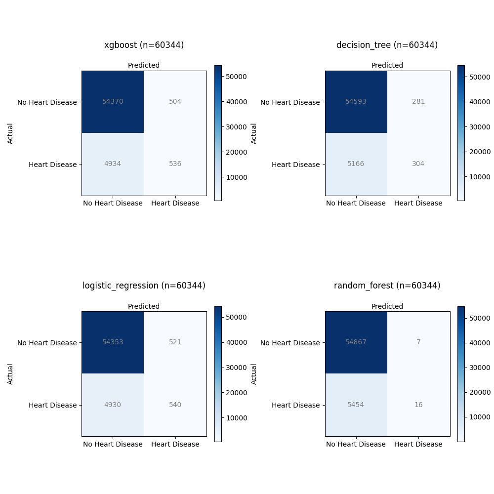
Heart Disease Model Confusion Matrix

  • XGBoost:

    • Total Samples: 60,344
    • Confusion Matrix Total:
      • True Positives (TP): 536
      • True Negatives (TN): 54,370
      • False Positives (FP): 504
      • False Negatives (FN): 4,934
  • Decision Tree:

    • Total Samples: 60,344
    • Confusion Matrix Total:
      • True Positives (TP): 304
      • True Negatives (TN): 54,593
      • False Positives (FP): 281
      • False Negatives (FN): 5,166
  • Logistic Regression:

    • Total Samples: 60,344
    • Confusion Matrix Total:
      • True Positives (TP): 540
      • True Negatives (TN): 54,353
      • False Positives (FP): 521
      • False Negatives (FN): 4,930
  • Random Forest:

    • Total Samples: 60,344
    • Confusion Matrix Total:
      • True Positives (TP): 16
      • True Negatives (TN): 54,867
      • False Positives (FP): 7
      • False Negatives (FN): 5,454

XGBoost:

  • This model achieved a relatively high number of True Positives (TP) with 536 cases correctly predicted as having heart disease.
  • It also had a significant number of True Negatives (TN), indicating correct predictions of no heart disease (54,370).
  • However, there were 504 False Positives (FP), where it incorrectly predicted heart disease.
  • It had 4,934 False Negatives (FN), suggesting instances where actual heart disease cases were incorrectly predicted as non-disease.

Decision Tree:

  • The Decision Tree model achieved 304 True Positives (TP), correctly identifying heart disease cases.
  • It also had 54,593 True Negatives (TN), showing accurate predictions of no heart disease.
  • There were 281 False Positives (FP), indicating instances where the model incorrectly predicted heart disease.
  • It had 5,166 False Negatives (FN), meaning it missed identifying heart disease in these cases.

Logistic Regression:

  • The Logistic Regression model achieved 540 True Positives (TP), correctly identifying cases with heart disease.
  • It had a high number of True Negatives (TN) with 54,353 correctly predicted non-disease cases.
  • However, there were 521 False Positives (FP), where the model incorrectly predicted heart disease.
  • It also had 4,930 False Negatives (FN), indicating missed predictions of heart disease.

Random Forest:

  • The Random Forest model achieved a relatively low number of True Positives (TP) with 16 cases correctly predicted as having heart disease.
  • It had a high number of True Negatives (TN) with 54,867 correctly predicted non-disease cases.
  • There were only 7 False Positives (FP), suggesting rare incorrect predictions of heart disease.
  • However, it also had 5,454 False Negatives (FN), indicating a substantial number of missed predictions of heart disease.

All models achieved a good number of True Negatives, suggesting their ability to correctly predict non-disease cases. However, there were variations in True Positives, False Positives, and False Negatives. The XGBoost model achieved the highest True Positives but also had a significant number of False Positives. The Decision Tree and Logistic Regression models showed similar TP and FP counts, while the Random Forest model had the lowest TP count. The trade-off between these metrics is essential for assessing the model's performance in detecting heart disease accurately.

Summary

In the quest to find the best solution for predicting heart disease, it's crucial to evaluate various models. However, it's not just about picking a model and hoping for the best. We need to be mindful of class imbalances – situations where one group has more examples than the other. This imbalance can throw our predictions off balance.

To fine-tune our models, we also need to adjust the hyperparameters. Think of it as finding the perfect settings to make our models have a better performance. By addressing class imbalances and tweaking those hyperparameters, we ensure our models perform accurately.

By using the correct data features and evaluating the performance of our models, we can build solutions that could assist healthcare professionals in evaluating an individual's risk profile for heart disease.

Thanks for reading.

Send question or comment at Twitter @ozkary Originally published by ozkary.com

11/29/23

Data Engineering Process Fundamentals - An introduction to Data Analysis and Visualization

In this technical presentation, we will delve into the fundamental concepts of Data Engineering in the areas of data analysis and visualization. We focus on these areas by using both a code-centric and low-code approach.

  • Follow this GitHub repo during the presentation: (Give it a star)

https://github.com/ozkary/data-engineering-mta-turnstile

  • Read more information on my blog at:

https://www.ozkary.com/2023/03/data-engineering-process-fundamentals.html

Presentation

YouTube Video

Section 1: Data Analysis Essentials

Data Analysis: Explore the fundamentals of data analysis using Python, unraveling the capabilities of libraries such as Pandas and NumPy. Learn how Jupyter Notebooks provide an interactive environment for data exploration, analysis, and visualization.

Data Profiling: With Python at our fingertips, discover how Jupyter Notebooks aid in data profiling—understanding data structures, quality, and characteristics. Witness the seamless integration with tools like pandas-profiling for comprehensive data insights.

Cleaning and Preprocessing: Dive into the world of data cleaning and preprocessing with Python's Pandas library, facilitated by the user-friendly environment of Jupyter Notebooks. See how Visual Studio Code enhances the coding experience for efficient data preparation.

Section 2: Statistical Analysis vs. Business Intelligence

Statistical Analysis: Embrace Python's statistical libraries, such as SciPy and StatsModels, within the Jupyter environment. Witness the power of statistical analysis for extracting patterns and correlations from data, all seamlessly integrated into your workflow with Visual Studio Code.

Business Intelligence: Contrast statistical analysis with the broader field of business intelligence, emphasizing the role of Python in data transformation. Utilize Jupyter Notebooks to showcase how Python's versatility extends to business intelligence applications.

Section 3: The Power of Data Visualization

Importance of Data Visualization: Unlock the potential of Python's visualization libraries, such as Matplotlib and Seaborn, within the interactive canvas of Jupyter Notebooks. Visual Studio Code complements this process, providing a robust coding environment for creating captivating visualizations.

Introduction to Tools: While exploring the importance of data visualization, let's talk about the powerful visualization tools like Power BI, Looker, and Tableau. Learn how this integration elevates your data storytelling capabilities.

Conclusion:

This session aims to equip attendees with a strong foundation in data engineering, focusing on the pivotal role of data analysis and visualization. By the end of this presentation, participants will grasp how to effectively utilize these practices, so they are able to start the journey on data analysis and visualization.

This presentation will be accompanied by live code demonstrations and interactive discussions, ensuring attendees gain practical knowledge and valuable insights into the dynamic world of data engineering.

Some of the technologies that we will be covering:

  • Data Analysis
  • Data Visualization
  • Python
  • Jupyter Notebook
  • Looker

Thanks for reading.

Send question or comment at Twitter @ozkary Originally published by ozkary.com

4/8/23

Data Engineering Process Fundamentals - Discovery Exercise

In this discovery exercise lab, we review a problem statement and do the analysis to define the scope of work and requirements.

Problem Statement

In the city of New York, commuters use the Metropolitan Transportation Authority (MTA) subway system for transportation. There are millions of people that use this system every day; therefore, businesses around the subway stations would like to be able to use Geofencing advertisement to target those commuters or possible consumers and attract them to their business locations at peak hours of the day.

Geofencing is a location based technology service in which mobile devices’ electronic signal is tracked as it enters or leaves a virtual boundary (geo-fence) on a geographical location. Businesses around those locations would like to use this technology to increase their sales.

ozkary-data-engineering-mta-geo-fence

The MTA subway system has stations around the city. All the stations are equipped with turnstiles or gates which tracks as each person enters or leaves the station. MTA provides this information in CSV files, which can be imported into a data warehouse to enable the analytical process to identify patterns that can enable these businesses to understand how to best target consumers.

Analytical Approach

Dataset Criteria

We are using the MTA Turnstile data for 2023. Using this data, we can investigate the following criteria:

  • Stations with the high number of exits by day and hours
  • Stations with high number of entries by day and hours

Exits indicates that commuters are arriving to those locations. Entries indicate that commuters are departing from those locations.

Data Analysis Criteria

The data can be grouped into stations, date and time of the day. This data is audited in blocks of fours hours apart. This means that there are intervals of 8am to 12pm as an example. We analyze the data into those time block intervals to help us identify the best times both in the morning and afternoon for each station location. This should allow businesses to target a particular geo-fence that is close to their business.

In the discovery process, we take a look at the data that is available for our analysis. We are using the MTA turnstiles information which is available at this location:

👉 New York Metropolitan Transportantion Authority Turnstile Data

We can download a single file to take a look at the data structure and make the following observations about the data:

Observations

  • It is available in weekly batches every Sunday
  • The information is audited in blocks of fours hours apart
  • The date and time field are on different columns
  • The cumulative entries are on the ENTRIES field
  • The cumulative exits are on the EXITS field
  • This data is audited in blocks of fours hours apart

ozkary-data-engineering-mta-discovery

Field Description

Name Description
C/A Control Area (A002) (Booth)
UNIT Remote Unit for a station (R051)
SCP Subunit Channel Position represents an specific address for a device (02-00-00)
STATION Represents the station name the device is located at
LINENAME Represents all train lines that can be boarded at this station. Normally lines are represented by one character. LINENAME 456NQR repersents train server for 4, 5, 6, N, Q, and R trains.
DIVISION Represents the Line originally the station belonged to BMT, IRT, or IND
DATE Represents the date (MM-DD-YY)
TIME Represents the time (hh:mm:ss) for a scheduled audit event
DESc Represent the “REGULAR” scheduled audit event (Normally occurs every 4 hours). Audits may occur more that 4 hours due to planning, or troubleshooting activities. Additionally, there may be a “RECOVR AUD” entry: This refers to missed audit that was recovered.
ENTRIES The cumulative entry register value for a device
EXIST The cumulative exit register value for a device

Data Example

The data below shows the entry/exit register values for one turnstile at control area (A002) from 09/27/14 at 00:00 hours to 09/29/14 at 00:00 hours

C/A UNIT SCP STATION LINENAME DIVISION DATE TIME DESC ENTRIES EXITS
A002 R051 02-00-00 LEXINGTON AVE 456NQR BMT 09-27-14 00:00:00 REGULAR 0004800073 0001629137
A002 R051 02-00-00 LEXINGTON AVE 456NQR BMT 09-27-14 04:00:00 REGULAR 0004800125 0001629149
A002 R051 02-00-00 LEXINGTON AVE 456NQR BMT 09-27-14 08:00:00 REGULAR 0004800146 0001629162

Conclusions

Based on observations, the following conclusions can be made:

  • Merge the DATE and TIME columns and create a date time column, CREATED
  • The STATION column is a location dimension
  • The CREATED column is the datetime dimension to enable the morning and afternoon timeframes
  • The ENTRIES column is the measure for entries
  • The EXITS column is the measure for exits
  • A gate can be identified by using the C/A, SCP and UNIT columns

Requirements

These observations can be used to define technical requirements that can enable us to deliver a successful project.

  • Define the infrastructure requirements to host the technology
    • Automate the provisioning of the resources using Terraform
    • Deploy the technology on a cloud platform
  • Define the data orchestration process
    • On the original pipeline, load the initial data for 2023
    • Create a data pipeline that runs every week after a new file has been published
    • Copy the unstructured CSV files into a Data Lake
  • Define a well-structured and optimized model on a Data Warehouse
    • Keep the source code for the models under source control
    • Copy the data into the Data Warehouse
    • Allow access to the Data Warehouse, so visualization tools can consume the data.
  • Create Data Analysis dashboard with the following information
    • Data Analysis dashboard
    • Identify the time slots for morning and afternoon analysis
    • Look at the distribution by stations
    • Look at the daily models
    • Look at the time slot models

Review the Code

In order to do our data analysis, we need to first download some sample data by writing a Python script. We can the analyze this data by writing some code snippets and use the power of the Python Pandas library. We can also use Jupyter Notebooks to quickly manipulate the data and create some charts that can help us as baseline requirements for the final visualization dashboard.

👉 Clone this repo or copy the files from this folder

Download a CSV File from the MTA Site

With this Python script (mta_discovery.py), we download a CSV file with the URL of http://web.mta.info/developers/data/nyct/turnstile/turnstile_230318.txt. The code creates a data stream to download the file in chunks to avoid any timeouts. We append the chunks into a local compressed file to reduce the size of the file. In order to reuse this code, we use the command line parser, so we can pass as parameters the URL.

import os
import argparse
from time import time
from pathlib import Path
import pandas as pd


def read_local(file_path: str) -> Path:
    """
        Reads a local file
        Args:
            file_path:  local file            
    """
    print(F'Reading local file {file_path}')
    df_iter = pd.read_csv(file_path, iterator=True,compression="gzip", chunksize=10000) 
    if df_iter:        
        for df in df_iter:
            try:                                
                print('File headers',df.columns)                                
                print('Top 10 rows',df.head(10))            
                break
            except Exception as ex:
                print(f"Error found {ex}")
                return

        print(f"file was loaded {file_path}")        
    else:
        print(F"failed to read file {file_path}")

def write_local(df: pd.DataFrame, folder: str, file_name: str) -> Path:
    """
        Write DataFrame out locally as csv file
        Args:
            df: dataframe chunk
            folder: the download data folder
            file_name: the local file name
    """

    path = Path(f"{folder}")
    if not os.path.exists(path):
        path.mkdir(parents=True, exist_ok=True)

    file_path = Path(f"{folder}/{file_name}")

    if not os.path.isfile(file_path):
        df.to_csv(file_path, compression="gzip")
        print('new file')
    else:
        df.to_csv(file_path, header=None, compression="gzip", mode="a")    
        print('chunk appended')

    return file_path

def etl_web_to_local(url: str, name: str) -> None:
    """
       Download a file    
       Args:
            url : The file url
            name : the file name

    """
    print(url, name)      

    # skip an existent file
    path = f"../data/"
    file_path = Path(f"{path}/{name}.csv.gz")
    if os.path.exists(file_path):
            read_local(file_path)            
            return

    df_iter = pd.read_csv(url, iterator=True, chunksize=10000) 
    if df_iter:      
        file_name = f"{name}.csv.gz"    
        for df in df_iter:
            try:                                                
                write_local(df, path, file_name)
            except StopIteration as ex:
                print(f"Finished reading file {ex}")
                break
            except Exception as ex:
                print(f"Error found {ex}")
                return

        print(f"file was loaded {file_path}")        
    else:
        print("dataframe failed")

def main_flow(params: str) -> None:
    """
        Process a CSV file from a url location with the goal to understand the data structure
    """    
    url = params.url  
    prefix = params.prefix

    try:
        start_index = url.index('_')
        end_index = url.index('.txt')
        file_name = F"{prefix}{url[start_index:end_index]}"
        # print(file_name)
        etl_web_to_local(url, file_name)
    except ValueError:
        print("Substring not found")


if __name__ == '__main__':

    os.system('clear')    
    parser = argparse.ArgumentParser(description='Process CSV data to understand the data')
    parser.add_argument('--url', required=True, help='url of the csv file')
    parser.add_argument('--prefix', required=True, help='the file prefix or group name')
    args = parser.parse_args()

    print('running...')
    main_flow(args)
    print('end')

Analyze the Data

With some sample data, we can now take a look at the data and make some observations. There are a few ways to approach the analysis. We could create another Python script and play with the data, but this will require to run the script from the console after every code change. A more productive way is to use Jupyter Notebooks. This tools enables us to edit and run code snippets in cells without having to run the entire script. This is a friendlier analysis tool that can help us focus on the data analysis instead of coding and running the script. In addition, once we are good with our changes, the notebook can be exported into a Python file. Let's look at that file discovery.ipynb:

import os
import argparse
from time import time
from pathlib import Path
import pandas as pd 

# read the file and display the top 10 rows
df = pd.read_csv('../data/230318.csv.gz', iterator=False,compression="gzip")
df.head(10)

# Create a new DateTime column and merge the DATE and TIME columns
df['CREATED'] =  pd.to_datetime(df['DATE'] + ' ' + df['TIME'], format='%m/%d/%Y %H:%M:%S')
df = df.drop('DATE', axis=1).drop('TIME',axis=1)
df.head(10)

# Aggregate the information by station and datetime
df["ENTRIES"] = df["ENTRIES"].astype(int)
df["EXITS"] = df["EXITS"].astype(int)
df_totals = df.groupby(["STATION","CREATED"], as_index=False)[["ENTRIES","EXITS"]].sum()
df_totals.head(10)

df_station_totals = df.groupby(["STATION"], as_index=False)[["ENTRIES","EXITS"]].sum()
df_station_totals.head(10)

# Show the total entries by station, use a subset of data
import plotly.express as px
import plotly.graph_objects as go

df_stations =  df_station_totals.head(25)
donut_chart = go.Figure(data=[go.Pie(labels=df_stations["STATION"], values=df_stations["ENTRIES"], hole=.2)])
donut_chart.update_layout(title_text='Entries Distribution by Station', margin=dict(t=40, b=0, l=10, r=10))
donut_chart.show()

# Show the data by the day of the week
df_by_date = df_totals.groupby(["CREATED"], as_index=False)[["ENTRIES"]].sum()
day_order = ['Sun', 'Mon', 'Tue', 'Wed', 'Thu', 'Fri', 'Sat']
df_by_date["WEEKDAY"] = pd.Categorical(df_by_date["CREATED"].dt.strftime('%a'), categories=day_order, ordered=True)
df_entries_by_date =  df_by_date.groupby(["WEEKDAY"], as_index=False)[["ENTRIES"]].sum()
df_entries_by_date.head(10)

bar_chart = go.Figure(data=[go.Bar(x=df_entries_by_date["WEEKDAY"], y=df_entries_by_date["ENTRIES"])])
bar_chart.update_layout(title_text='Total Entries by Week Day')
bar_chart.show()

How to Run it!

With an understanding of the code and tools, let's run the process.

Requirements

👉 Install Python, Pandas and Jupyter notebook

👉 Install Visual Studio Code

👉 Clone this repo or copy the files from this folder

Follow these steps to run the analysis

  • Download a file to look at the data
    • This should create a gz file under the ../data folder
$ python3 mta_discovery.py --url http://web.mta.info/developers/data/nyct/turnstile/turnstile_230318.txt

Run the Jupyter notebook (dicovery.ipynb) to do some analysis on the data.

  • Load the Jupyter notebook to do analysis
    • First start the Jupyter server from the terminal
$ jupyter notebook
  • See the URL on the terminal and click it to load it on the browser
    • Click the discovery.ipynb file link
  • Or open the file with VSCode and enter the URL when prompted from a kernel url
  • Run every cell from the top down as this is required to load the dependencies

The following images show Jupyter notebook loaded on the browser or directly from VSCode.

Jupyter Notebook loaded on the browser

ozkary-data-engineering-jupyter-notebook

ozkary-data-engineering-discovery-query

Using VSCode to load the data and create charts

ozkary-data-engineering-discovery-jupyter-vscode

Show the total entries by station using a subset of data using VSCode

ozkary-data-engineering-discovery-donut-chart

Next Step

👉 Data Engineering Process Fundamentals - Design and Planning

Thanks for reading.

Send question or comment at Twitter @ozkary

👉 Originally published by ozkary.com